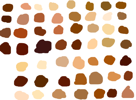
skin color ref because some of yall non-black poc and whites keep fucking up as if yall don’t know there’s other shades of brown when u racebend for woke points or something
Anon asked how I draw my hands! This is far from an accurate representation on how to draw them anatomically correct. But If you want to draw em’ like i do then this is how you do it!
In the conclusion for now, some things I’d really recommend doing if you’re seriously considering making a webcomic (or really a comic in general). Some of these don’t really apply to strips or gag-a-day type of comics, but I’m not talking about those here.
1. Write down ideassketch stuff, LEGIBLY. “I’m gonna remember it later” NEVER works. And if you scribble it somewhere on a piece of paper, you’d better scan it or retype in one doc later, because tiny notes always get lost among other doodles in my skethbooks.
(i know it’s hard to keep everything clean and organized, but this mess is just not productive)
If your project is a collaboration, save your conversations. If you’re working alone, make a blog for your ramblings. You have no clue what tears of relief I cry when I open that blog and rememeber I don’t have to painstakingly look through my heaps of sketchbooks and folders for a tiny idea I’m not even sure I wrote down a few months ago.
2. Inspiration folders, or even better, inspo blog with tags also help with collecting and remembering ideas. Color schemes, landscapes, style inspirations, atmospheric stuff, maybe some photo references, all those neat things.
3. Basic tier: character design sheets. Top tier: common poses, expressions. God tier: outfits they wear throughout the comic. Holy cow tier: turnaround sheets for all those outfits.
(I’d die trying to find good pages for references without these)
4. If you haven’t finished detailing the plot, don’t even think about moving on to drawing the comic. You’re gonna regret it when you come up with a really cool plot element that can’t be incorporated anymore because you’ve already drawn all the parts you could’ve tweaked.
5. Don’t just define the plot, make a script. Writing down the lines and the brief description of the actions serves me fine:
(notice that I approximately divided the pages & the text that’d go to each panel on a page)
6. Hard mode: make thumbnails for all the pages, if possible. At least whenever a new chapter starts.
7. If your story involves some convoluted chronology shenanigans, you’d better write down the events of your timeline in the chronological order.
8. Backgrounds. You can’t avoid them, bro. Like half of the comics are backgrounds, especially if your story involves a lot of adventuring and looking around. I know it hurts, but you’ll have to become friends with them. Read some tutorials, practice on photos, go out and sketch some streets, use 3d programs (like Google Sketch) to understand the perspective, use sites like houseplans to visualize your buildings
better, I don’t know. Just be prepared for their imminent evil.
9. If you’re drawing digitally, pick a brush size for the lines and stick with it. You don’t want your lines and detail levels to look all wonky and inconsistent in different panels. And I don’t mean the cool stylistic varying lines, I mean this:
Also, things on the background should have thinner and/or lighter lines to avoid distraction. Usually less details too, unless you’re making a busy background with a simple foreground to help it pop out. Or wanna draw the attention to an object on the bg.
10. Readable fonts. Even if you chose to ignore people with poor sight or dyslexia, the majority of your readers aren’t gonna be excited about struggling to decypher this:
Also, as much as I love my black speech bubbles, colorful text on black still kinda hurts the eyes. I wouldn’t recommend doing that for all the characters. Black speech bubbles are usually used for creepy, inhuman voices. And yes, having a colorful outline in this case helps.
11. Probably newsflash, but did you know that panels have their place, order and functions? They do! My favourite thing ever is how I used panels when I was like 12:
(comics ain’t rocket science, but this one is)
The composition of the panels and word balloons always serve for a better reading experience. They guide your eyes over the page, so that you never feel lost or confused. The images in the comic equal frames in a movie, so it’s pretty damn important in what order you look at things and how quickly you can understand what’s going on!
(Eric Shanower & Scottie Young’s Wizard of Oz)
12. One update a week is fine for testing waters. Don’t overestimate yourself, especially if you have a pretty busy life outside it. A stable comic that updates slowly, but regularly is better than an unpredictable erratic one. You can always pick up the pace later, if you feel confident enough.
13. Try to always have a buffer – a couple of pages in reserve. If you’re making the pages much faster than you’re updating, this shouldn’t be a problem. But if those paces are equally the same, it’s goddamn HARD. But on the other hand, if something happens and you skip an update, those come in handy.
If you’re looking at this list and thinking “wow that’s a LOT of work”, you’re totally right. And it’s okay to be intimidated at first! But that’s why it’s important to start with something small. Once you get the formula down, these things will be natural to you.
Hello anon! 😀 I’m not the best at making tutorials and giving tips but I’ll do my best to answer your question! ^^
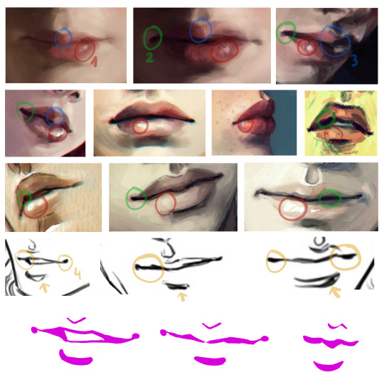
I sure do love drawing lips! It might be in fact my favourite part of the face to draw.
Let’s see what makes them so irresistible 😉
tip 1: let them shine! that tiny shiny spot does wonders for the lips – it makes them fuller, softer and more three dimensional. It also makes the lips look slightly wet. Sexy!
tip 2: Build the depth with some darker spots. Quirking corners are great for that, and if you make the darkest spot in the middle of the mouth it seems like it’s about to part. And maybe whisper something seductive 😉
tip 3: The very middle of upper lip is my favourite area, it gives the mouth its distinct character. It’s also a great spot to play with shadows, one lighter stroke, one darker stroke and you have a very dramatic shading going on!
tip 4: When drawing lineart it’s good to keep the line varying in width and pressure. Equally thin, flat line might look good in anime, but even there it’s rarely the case. Making the line thicker in the shadowy part of the mouth adds depth to your drawing.
General remarks:
I almost never outline the upper lip, it tends to look weird. Just a thin “U” shape in the middle is usually enough.
Upper lip is usually in the shadow, at least half of it. Lower lip tends to catch the light, especially with pouty plump lips. The more shadow you add under it, the fuller the lips look.
When drawing male characters I usually play around with skin tones instead of pink and red (see the third row of examples). But it’s not a rule. Some boys rock them rosy lips. 😉
Never paint the teeth white, never. Gray, yellowish and pinkish tones are great.
And the final tip: use reference! Look for pictures of people with beautiful lips, with thin lips and full lips, try to see which line goes where and how it changes the shape and expression. I hardly ever draw without a reference.
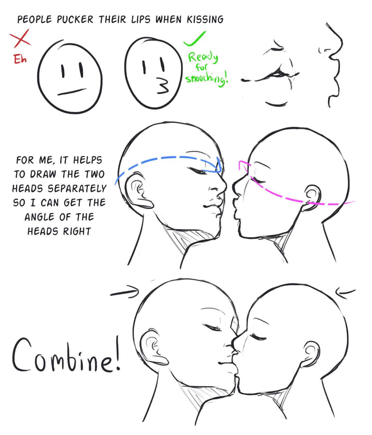
i made this in like 10 minutes so excuse my shitty diagrams (so i added examples from my own art)
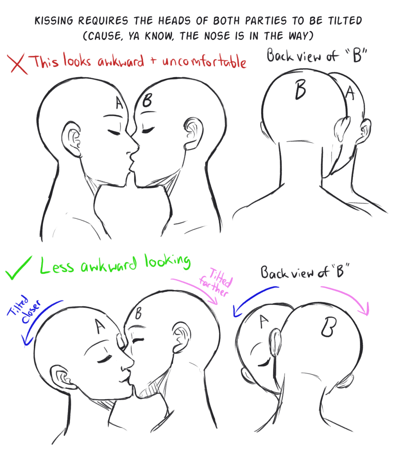
a lot of people have been asking me how to not draw trans guys offensively so i wanted to try to give a small “how-to” without being like “YOU MUST DRAW THEM LIKE THIS” because everyone’s body is different and a lot is up to interpretation
As simple as it sounds, a character “standing up straight” or “slouching down” reveals so much about them. It would be unwise to not think about the role of the spine when posing out your character. Even the slightest extension, contraction or twist will bring nuance to a pose. You can also think of another character “mirrroring” the posture to empathize with the other or fit in a group he/she is new in. Overall, it’s the foundation of most poses. Emphasize or minimize to create the effect you want in your story! -Norm @grizandnorm #tuesdaytips #100tuesdaytips #100tuesdaytipsbook #arttutorial #arttips #growaspine